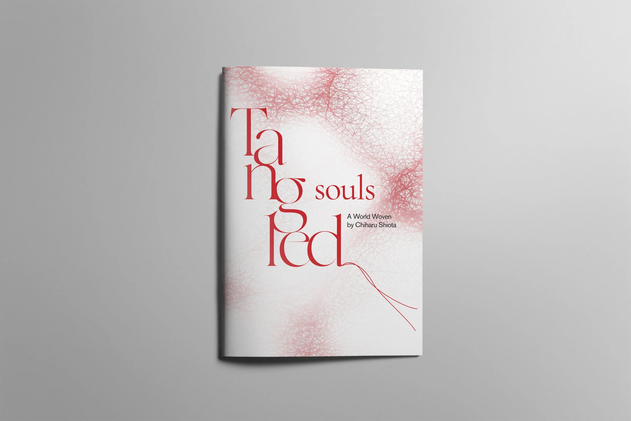
Tangled Souls
Exhibition Identity, Publication, Wayfinding
Tangled Souls is an exhibition identity created for artist Chiharu Shiota, whose large installations of red, black, and white threads explore memory and human connection. I chose serif typography to reflect the depth of her work and added subtle line elements that echo the feeling of threads. The design remains intentionally delicate, allowing her powerful installations to take center stage while adding a gentle layer of support.
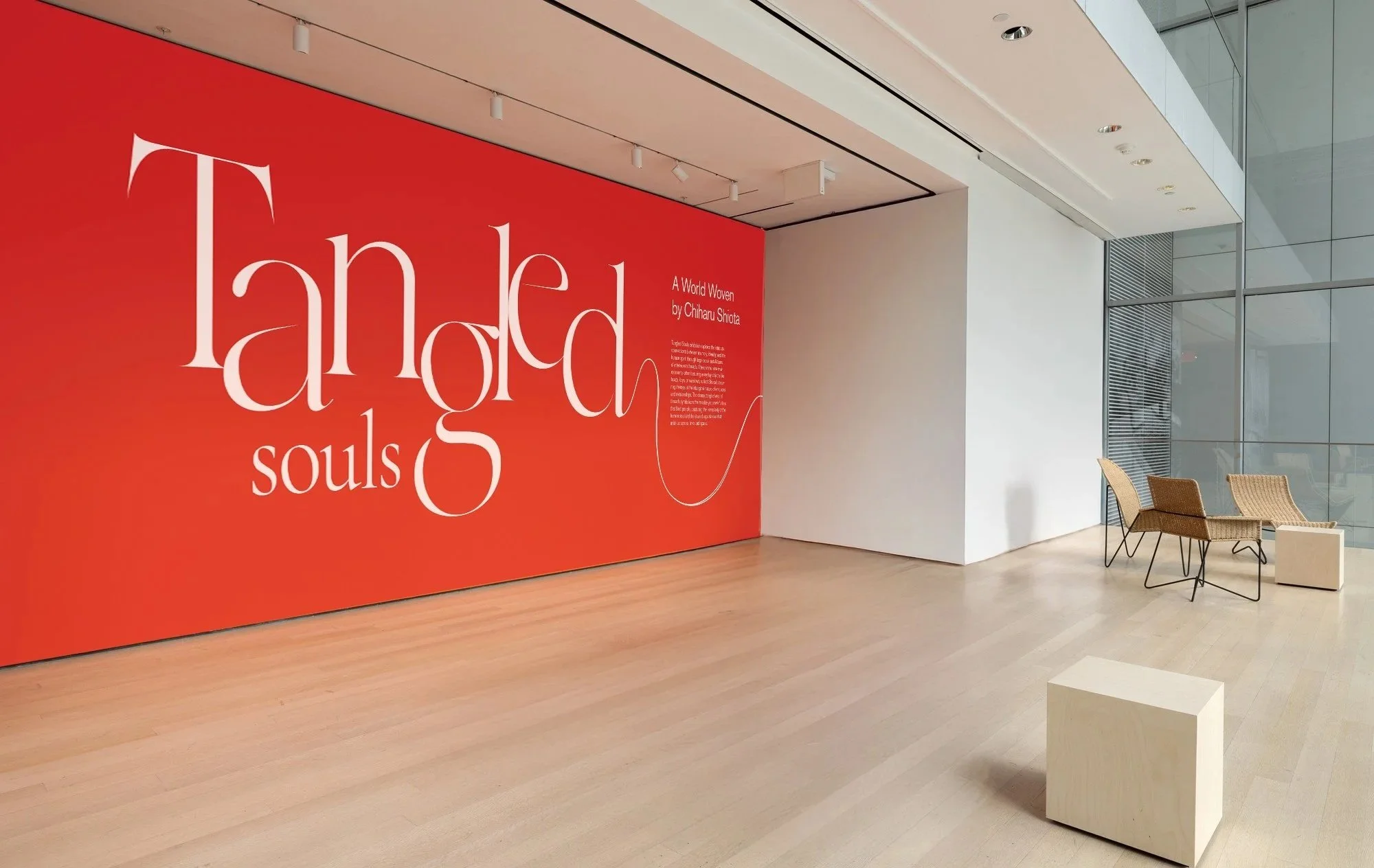
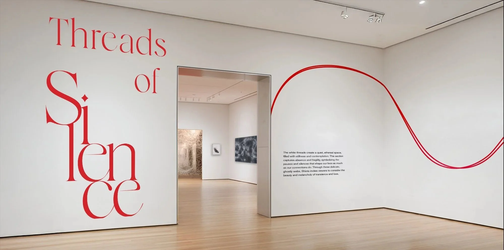
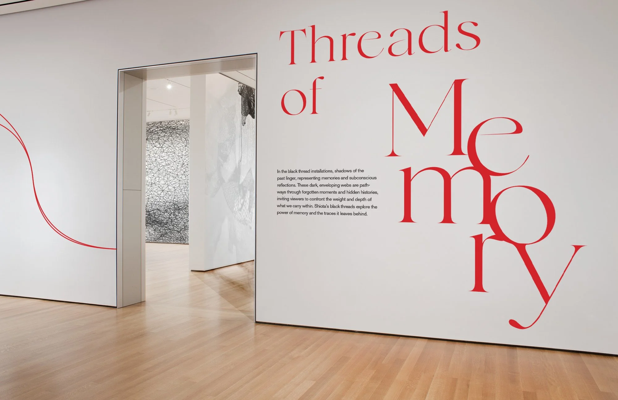
The wall graphics and wayfinding system draw directly from Shiota’s threaded installations, using flowing lines to guide visitors through the space with a sense of quiet continuity. Large serif typography anchors each room, echoing the emotional weight of her work while keeping the visual language gentle and unobtrusive. Together, the lines and type create a subtle pathway that leads visitors through the exhibition without distracting from the power of the installations themselves.
Exhibition Wall Graphics

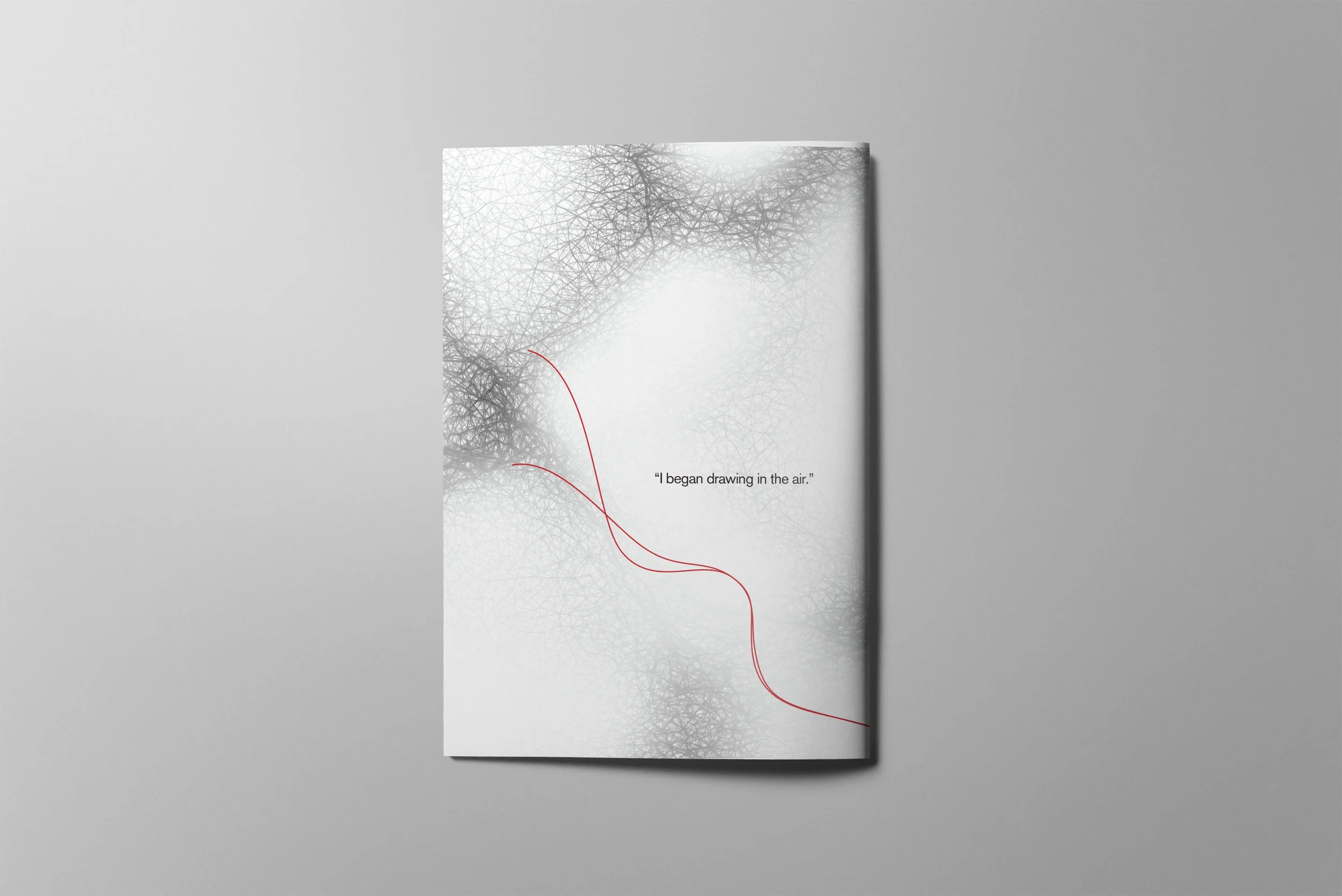
The poster series captures the tension and delicacy of Shiota’s work through expressive typography and thread-like line forms. Each poster uses scale, contrast, and subtle texture to echo the feeling of suspended threads while keeping the visuals restrained enough to let her installations remain the focus. Together, the set creates a quiet yet striking introduction to the exhibition’s themes of memory, connection, and emotional depth.
Print Identity Series

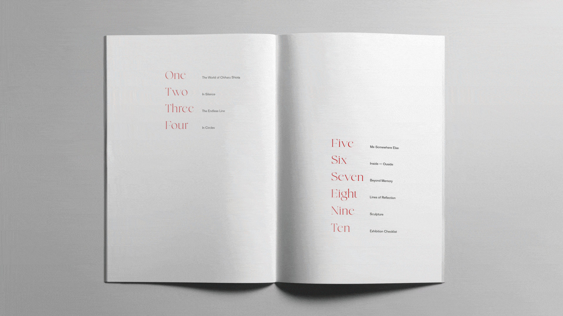
The exhibition catalog extends the identity through soft gradients, delicate thread textures, and refined serif typography. Each spread is paced with quiet space and subtle rhythm to reflect the meditative quality of Shiota’s work. The design remains minimal and calm, allowing the imagery and themes of memory, tension, and connection to unfold with clarity and intention.
Exhibition Publication
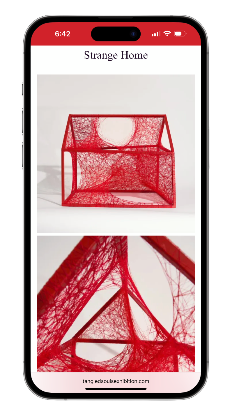
The print applications translate the identity into tactile moments that visitors can hold and take home. Postcards, stickers, wristbands, packaging, and merchandise all use the same delicate thread motifs and refined typography to maintain a cohesive visual language. Each piece is designed to feel like a small extension of the exhibition, capturing the quiet tension and emotional resonance of Shiota’s work in accessible, everyday forms.
Print Applications


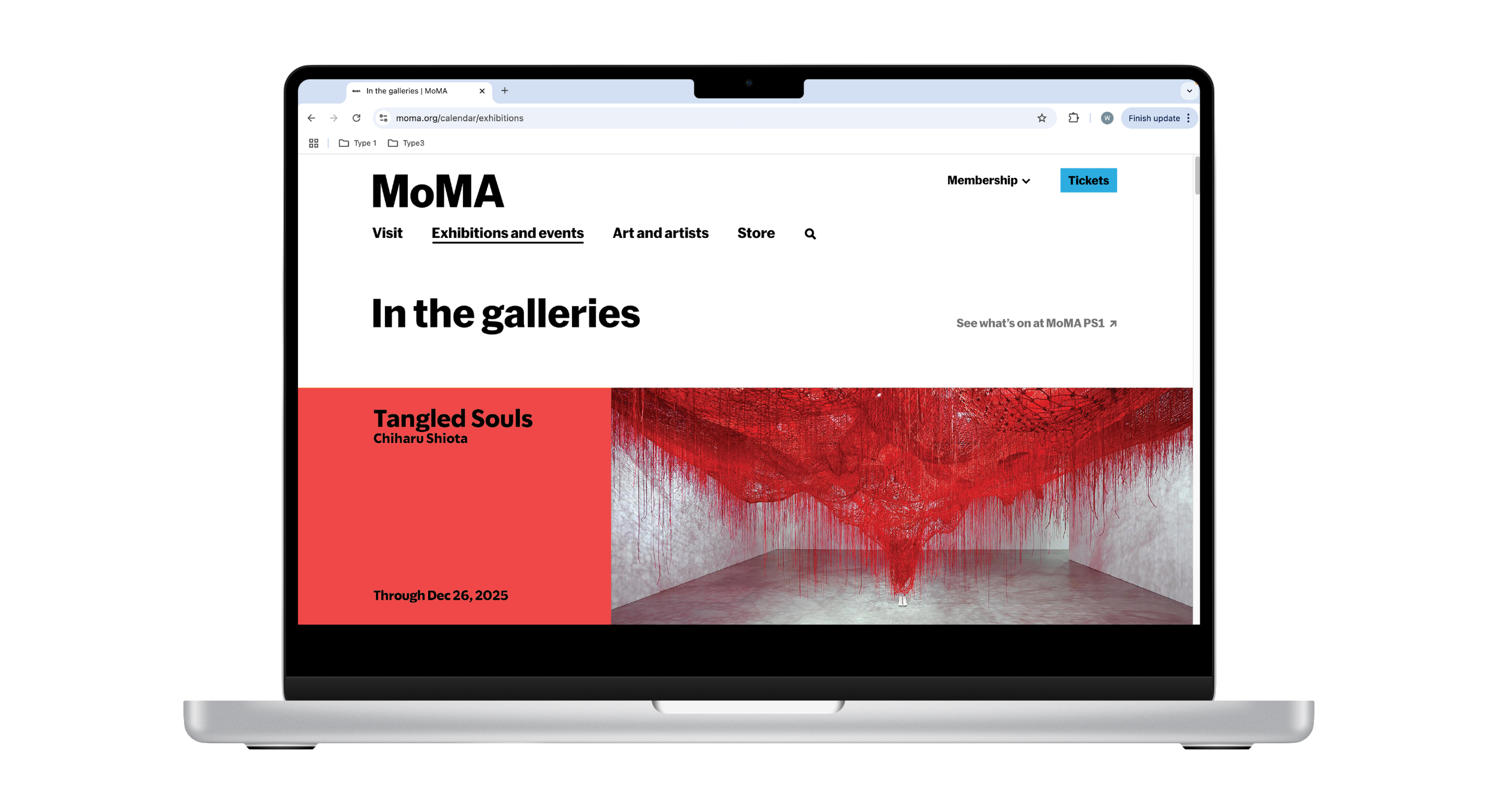
The web experience continues the exhibition’s visual language online with soft thread textures and refined type. Visitors can access the auction page through a QR code on their wristband ticket, allowing them to explore and bid on works after leaving the gallery. All proceeds support MoMA’s education and outreach programs, extending the impact of the exhibition beyond the physical space.
Digital Applications