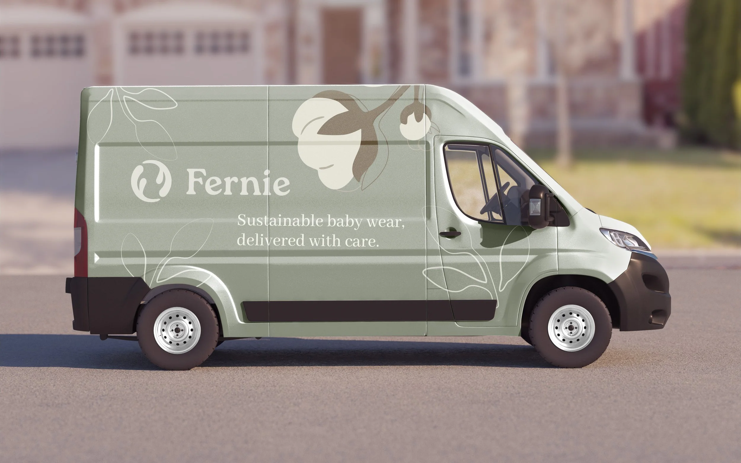
Fernie
Fernie is a sustainable babywear brand created to rethink how parents shop for their growing children. I approached this project as an opportunity to design a system that balances emotional warmth with practical sustainability, turning an everyday routine into an act of care and renewal. I introduced a circular subscription model and recycle program that extend the life of every garment. Through calm typography, gentle color, and tactile materials, the brand expresses softness and trust while inspiring parents to nurture both their child and the planet.
Sustainable Babywear Branding
Spatial
Trade Show / Pop Up
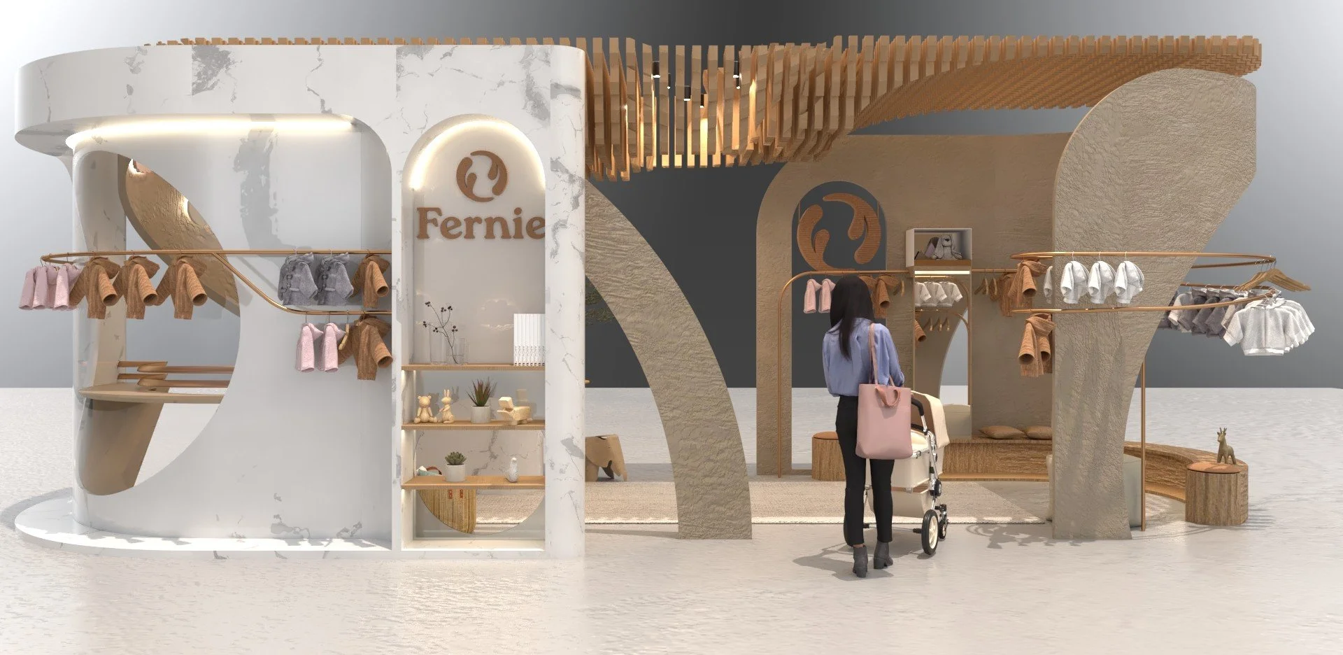
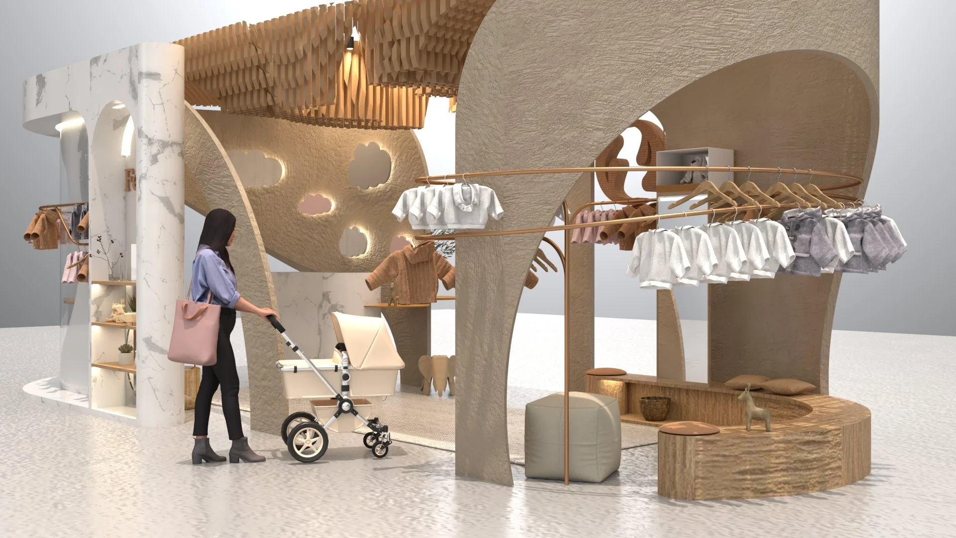
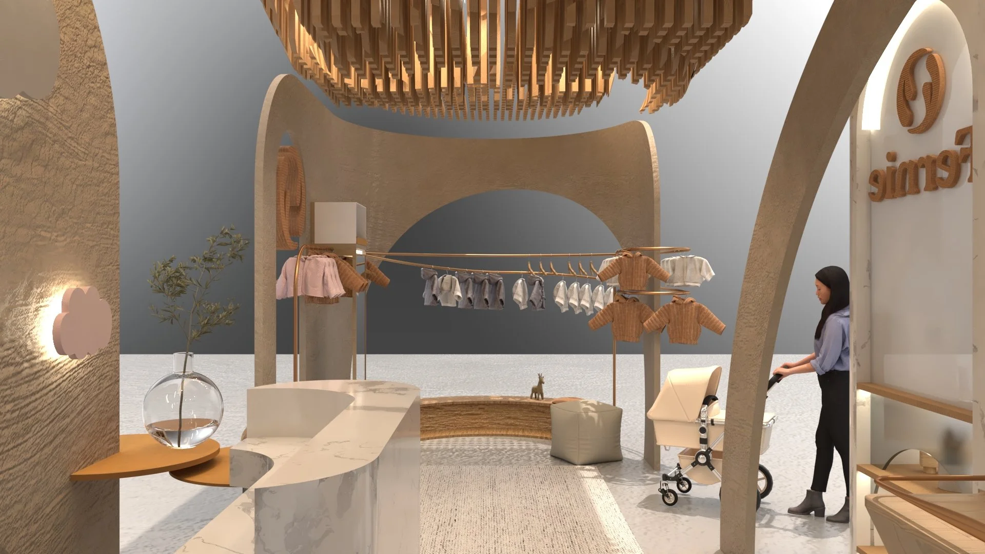
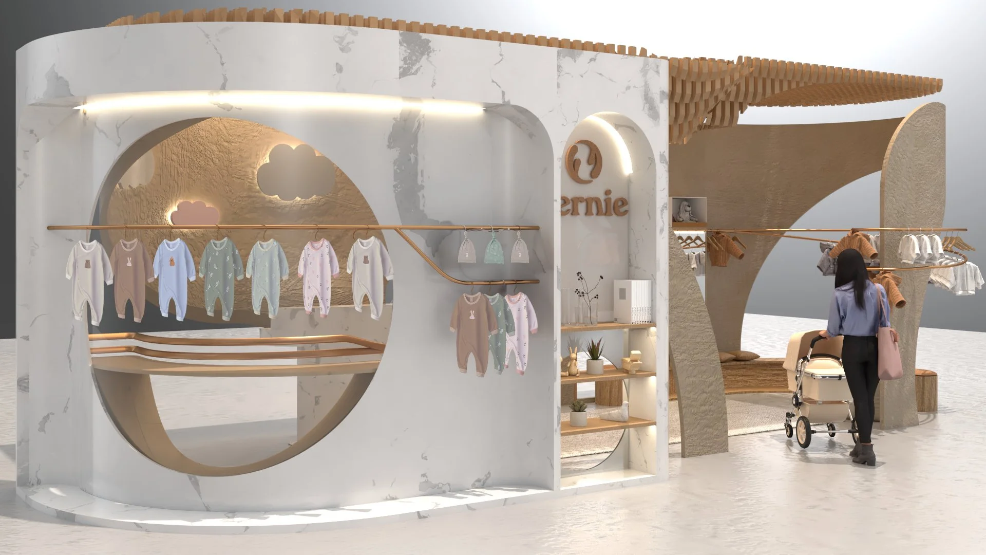
Designed in Rhino 8 and rendered with V-Ray, this tactile trade show booth invites new parents into a warm, sensory-first environment. The spatial design draws inspiration from the Fernie logo’s circular form and layered softness, creating a space where visitors not only shop but feel part of the brand’s world.

Logo

The Fernie logo is inspired by the recycle symbol, but I softened it to look like arms wrapping around a baby. It represents both care and sustainability. For the typeface, I chose one that feels a little uneven, almost like a baby taking its first steps — cute, soft, and a bit wobbly.
Packaging
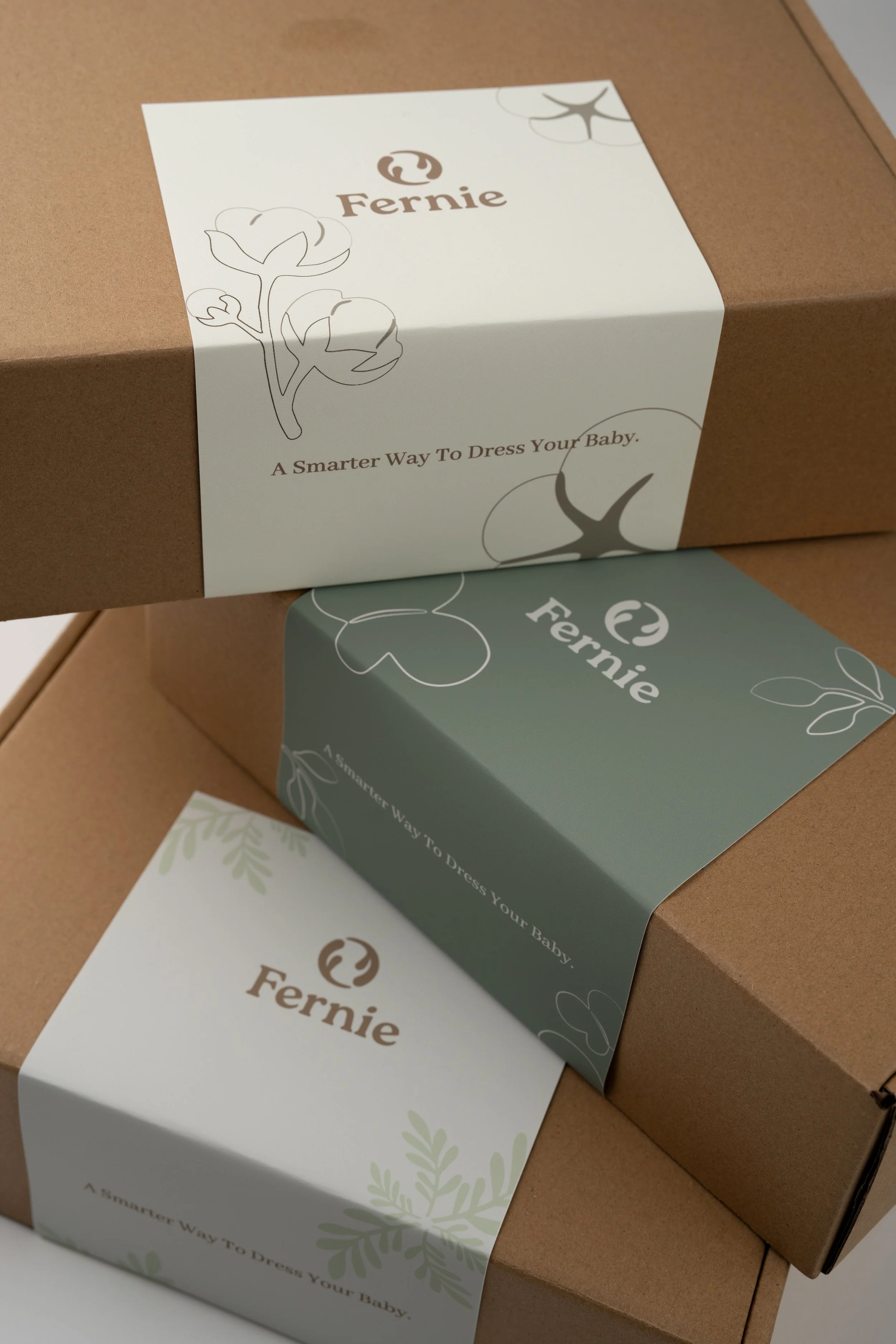
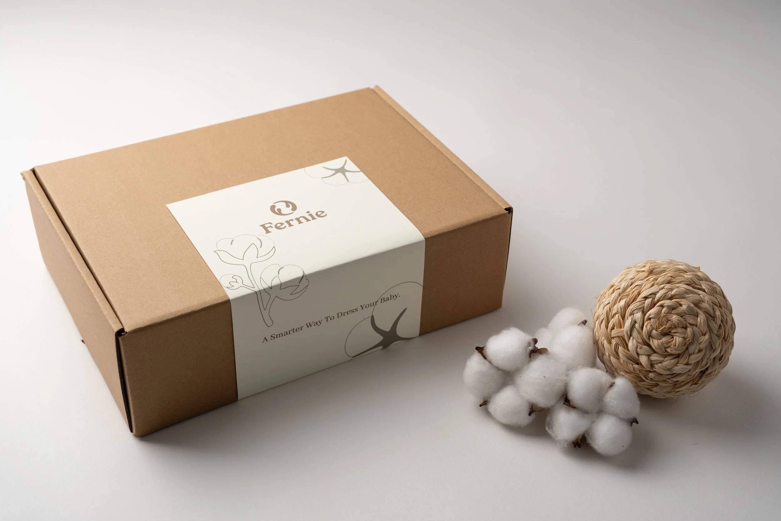
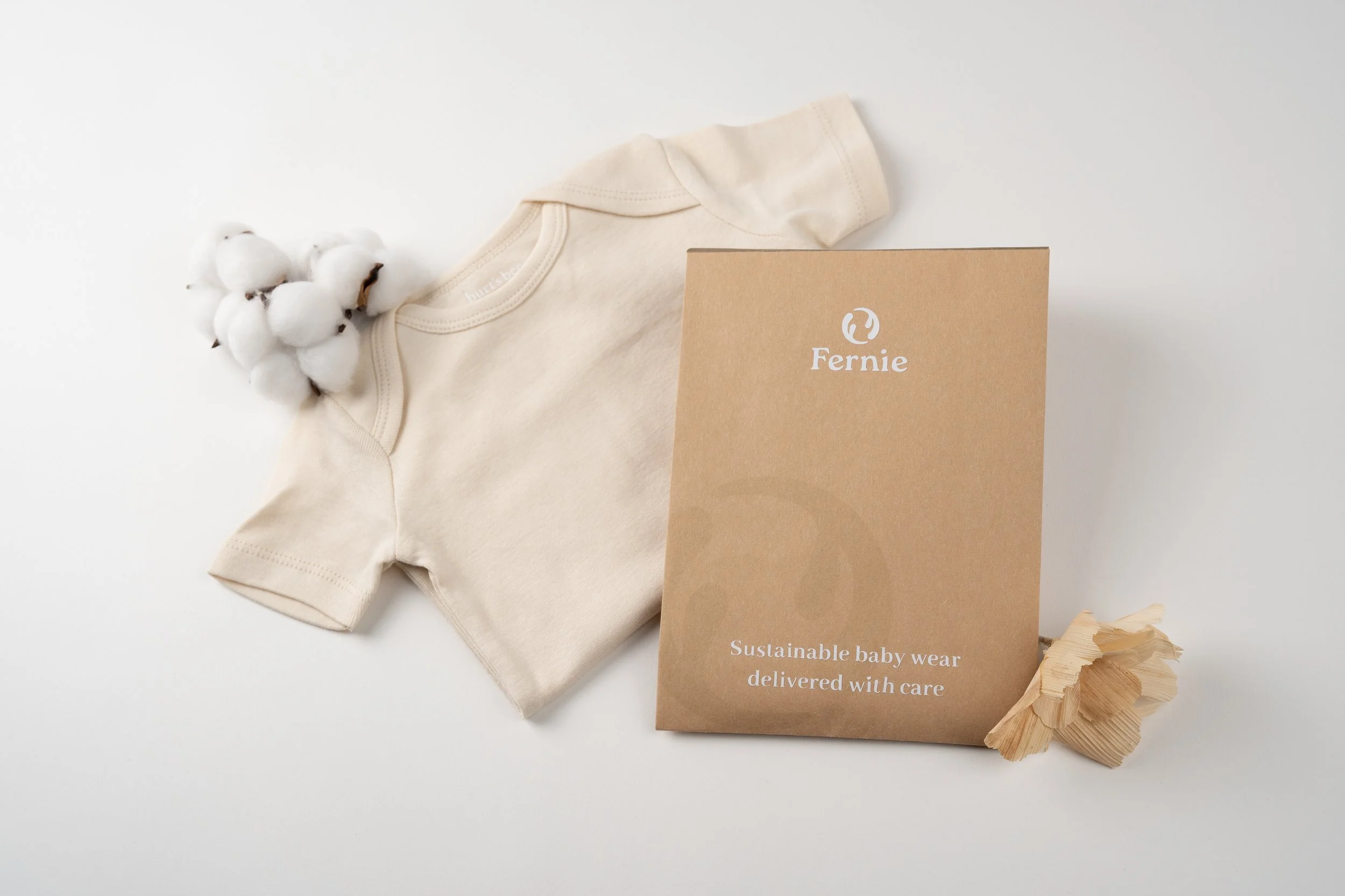
The packaging is fully recyclable and uses soy-based inks. It’s playful and soft, featuring my hand-drawn illustrations to bring a personal, warm touch to every delivery and create a thoughtful unboxing experience
Photo by Amanda Mei
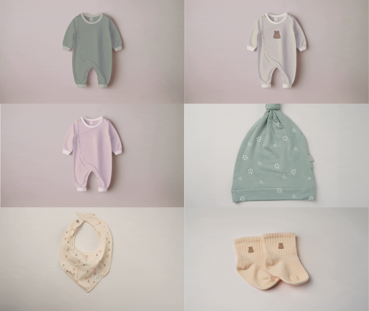
Clothing Collection
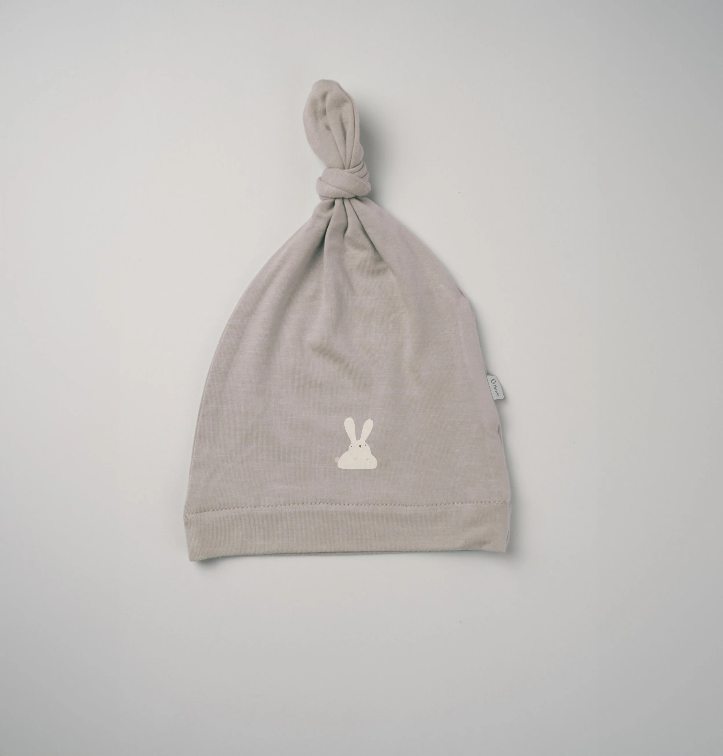
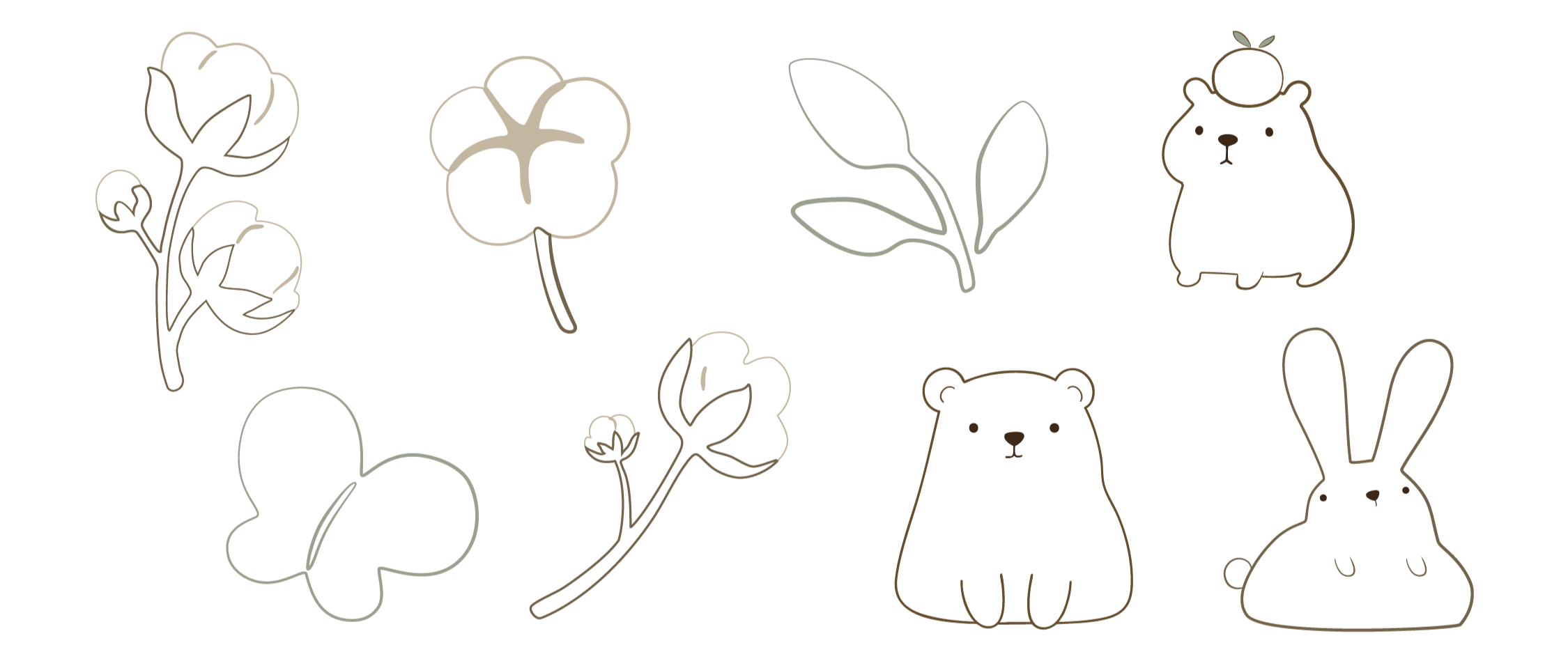
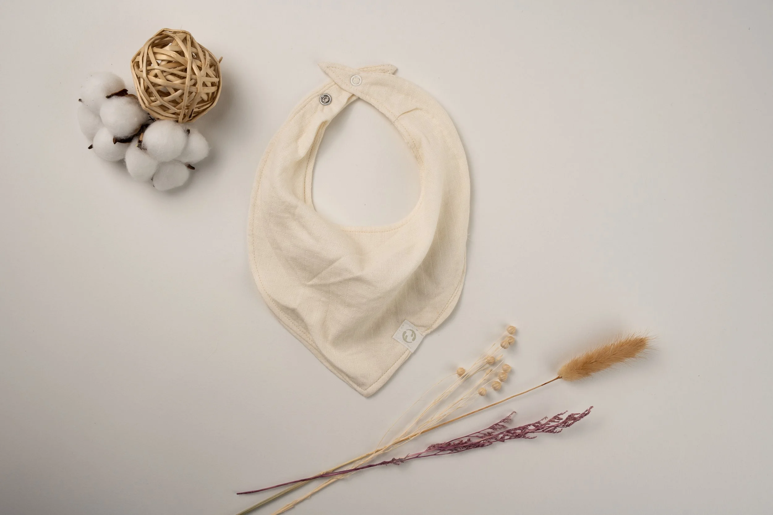
The collection features my own illustrations of simple, nature-inspired line drawings and gentle animal characters, creating a cohesive and recognizable visual language that reflects Fernie's natural beauty while bringing warmth, playfulness, and a sense of adventure to the brand across a diverse range of products.
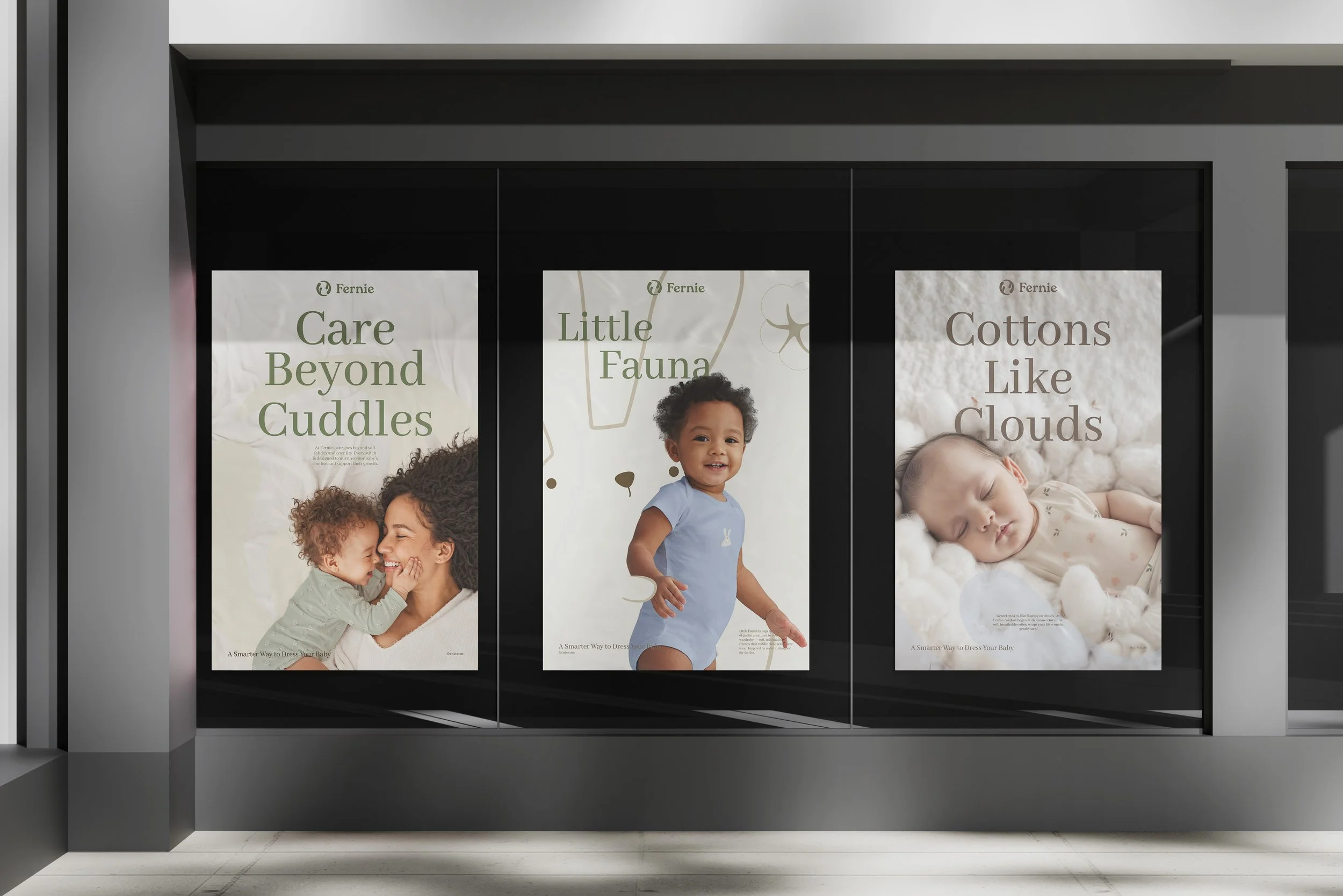
Brand Applications